
A one-page site feels fast to launch. For most local shops, it hides the pages customers and Google both need.
I still see the same pitch: one long scroll, big hero photo, five sections stacked, and a hope that “everything is on one page.” It looks clean in a mockup. It fails when someone wants your services list, your proof, and your phone number without hunting.
This guide is for owners and ops leads who want a live website build that is findable, shareable, and easy to update. It is not a design contest. It is a practical page map that matches how people actually look you up.

What a one-pager gets wrong for local work
A one-pager tries to be the home page, the services page, the about page, the gallery, and the contact form at once. That mash-up creates three problems I see every week.
First, sharing breaks. When a customer texts a friend, they need a clean link to “AC repair” or “oil change specials,” not a scroll position on a giant home page. Second, search engines and Maps want clear pages with clear titles. A single URL with five topics rarely ranks for the query that pays the bills. Third, updates get scary. Change one price and you are editing a fragile megapage where one bad paste wrecks the whole layout.
I am not against short sites. I am against fake simplicity. Five focused pages are often simpler to run than one overloaded scroll.
The five pages that pay rent
Use this map as a default. Rename labels to fit your trade. Keep the jobs the same.
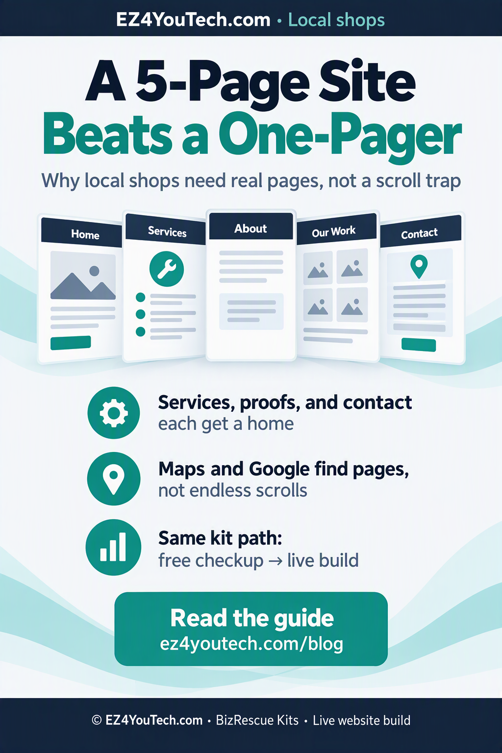
- Home. Who you serve, what you fix, and one clear next step. Not your life story.
- Services. The real menu. Separate sections or subpages if you sell more than three distinct jobs.
- About. Face, crew, cities you cover. Local shops win when people know you are nearby and real.
- Our Work (proof). Reviews, before/after, licenses, insurance, or a short case note. Make trust visible.
- Contact. Phone, form, map, hours. Nothing else competing for attention.
That is a five-page site (same map as the shareable flyer). Some shops add a sixth for a narrow offer or hiring. Start with five. Do not start with a brochure that never ends.
Why Google and Maps prefer pages
People do not type “cool one-pager.” They type “plumber near me,” “brake repair Frisco,” or your shop name plus “hours.” Search systems match queries to pages with clear titles and content. When five topics fight on one URL, the page dilutes its own signal.
Maps and profile links also love clean destinations. If your Google Business Profile points at a contact page with hours and a form, the click path is honest. If it dumps people into a long scroll, many bounce before they call.
Internal links help too. From Home to Services to Contact is a path a stranger can follow on a phone with one thumb. A one-pager asks them to hunt.
What to put on each page (short checklist)
Home: one promise, three services, one proof line, one button to call or book. Stop there.
Services: name the job the way customers say it. Add price ranges only if you honor them. Link each major service to Contact.
Proof: five real reviews beat twenty vague adjectives. Add photos that show the work, not stock smiles.
About: who shows up, what cities you cover, how long you have been at it. Skip the mission poem.
Contact: click-to-call, form, map embed, hours. If the form fails on mobile, fix that before you buy ads.
How this ties to BizRescue and live builds
On EZ4YouTech.com we treat the site as part of the shop’s operating kit, not a side hobby. The free checkup often finds the same issue: a pretty scroll with no clean services URL and a buried phone number. The fix is rarely “more animation.” The fix is pages with jobs.
If you want the build done for you, the live website build path and BizRescue Kits both start with what a stranger must find in under ten seconds. Five pages make that test pass.
A one-week cut plan if you already have a one-pager
- List the five jobs above. Highlight which content already exists in the scroll.
- Create empty Services, Proof, About, and Contact pages. Move blocks. Do not redesign yet.
- Give each page a plain title tag that matches how customers search.
- Update your Google Business Profile website link to Contact or Home, whichever is clearer.
- Delete the leftover mega-scroll once the five pages answer the phone test.
If a section does not fit those five jobs, it is probably decoration. Park it. You can add a blog later. You cannot afford a contact path that only works for people who already love you.
Quick answers owners ask
Is five pages more expensive? Usually no. Hosting is the same. Writing clear pages is cheaper than rebuilding a broken one-pager twice.
What about landing pages for ads? Keep paid landers separate. Do not smash ad copy into the main Contact page.
Do I need a blog? Not on day one. Services and Contact first. Content marketing later.
Can I keep a long Home? Home can be short and strong. Depth belongs on Services and Proof.
Mobile reality check
Most local searches happen on a phone in a parking lot or a kitchen. Thumb reach matters. A five-page map with big call buttons beats a poetic scroll that hides the number behind three sections of stock photography.
Test it yourself. Open your site on your phone. Time how long it takes to find the phone number and a services list. If it takes more than ten seconds, customers are already comparing you to the next listing.
Also check what happens when someone shares your link in a group chat. Does the preview show a useful title? Does the URL look like a real page? One-pagers often preview as a generic home title that says nothing about brakes, roofs, or HVAC.
Content you can steal from paperwork you already have
You do not need a copywriter to start. Pull the services list from your invoices. Pull proof from the Google reviews you already earned. Pull cities from the jobs you already drive. Put each block on the right page. Plain English beats clever slogans.
If a service name only makes sense inside your shop, rewrite it the way a customer would search. “Synthetic blend special” might be fine on a receipt. On the web, “oil change” still needs to appear in the title and the first paragraph.
Photograph real bays, real trucks, and real completed jobs when you can. Stock photos of smiling strangers make shops look rented. One honest before-and-after on the Proof page does more work than a carousel of generic smiles.
Ads, SEO, and the same five pages
Paid clicks into a muddy one-pager waste money. Send ad traffic to a focused Services or offer page that still links to Contact. Keep the main five-page map stable so organic search and Maps stay consistent while campaigns come and go.
SEO for local shops is mostly clarity: correct NAP details, clear service pages, and a Contact page that loads fast. You do not need a hundred blog posts before you fix those basics. Five clean pages beat a blog that nobody can find from the home screen.
When you do add a blog later, link posts back to Services and Contact. A post without a next step is a magazine. A post with a call path is a tool.
Owner objections I hear (and answers)
“My nephew said one page is modern.” Modern for portfolios. Local service shops win on findability and calls. Measure those, not trends.
“I do not want to maintain five URLs.” You already maintain five topics. Separating them makes edits safer, not harder.
“We only have one service.” You still need Home, Proof, About, and Contact. Services can be short. Do not collapse proof into a footnote.
“We will redesign later.” Structure first. Paint later. A pretty one-pager with a buried phone number still loses calls.
Bottom line
A five-page site is not “more website.” It is a clearer map for customers, Maps, and your future self when prices change. One-pagers look tidy in a portfolio. Local shops need pages that get found and get the phone to ring.
Read this with your current site open. If you cannot paste five clean URLs into a text to a friend, you do not have a five-page site yet. Fix that before you buy another logo animation.
When you are ready for a done-with-you build, start with the free checkup path on EZ4YouTech.com or a BizRescue kit conversation. Bring your current URLs. We will mark what moves to which page before anyone argues about colors.
Image credits
- Local shop storefront · Photo by Artem Beliaikin on Unsplash (1441986300917-64674bd600d8)
- 5-page flyer · Art: EZ4YouTech.com (Designer)
Next step
More plain-language notes for local shops and BizRescue kits.